Customization
Applying custom styling to your payment form components.
You are able to adjust the styling of the payment components to match the style of the rest of your payment form by passing style attributes when you add the component to your payment form.
General Styling
General styling options are applied to the whole component and mainly affect the appearance of the textual elements.
padding - specify the CSS padding property
color - specify the CSS color property
fontFamily - specify the CSS font-family property
fontSize - specify the CSS font-size property
fontStyle - specify the CSS font-style property
fontWeight - specify the CSS font-weight property
textAlign - specify the CSS text-align property
textTransform - specify the CSS text-transform property
textShadow - specify the CSS text-shadow property
Input Styling
Input styling options are specifically applied to any inputs within the component.
backgroundColor - specify the CSS background-color property for the input elements. Note that the payment component itself will inherit the background color of the element you add it to.
border - specify the CSS border property for the input elements.
When styling individual components other than the Full Card component, you have a few extra options to give you more fine-grained control over the input borders.
borderRadius - specify the CSS border-radius property for the input elements.
borderWidth - specify the CSS border-width property for the input elements.
borderColor - specify the CSS border-color property for the input elements.
Label Position
You can control the position of the labels by passing the label parameter when adding a component to your payment form. The options are:
above - display labels above the corresponding input element (default)
inside - display labels inside the corresponding input element, as a placeholder
none - do not display labels at all. Note that you cannot switch off labels for the FullCard component
Label Name
You can also control the text of the labels by passing a supported input element and within, a name parameter.
Supported Payment Fields
cardholder_name
card_number
expiry_date
cvd
Supported Address Fields
Address fields are nested within an encompassing address parameter
address_1
address_2
city
state
country
postal_code
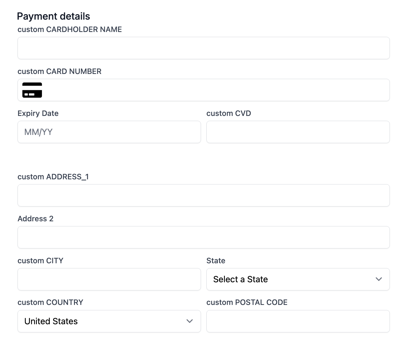
Full Card Code Example

const exact = ExactJS("YOUR_ACCESS_TOKEN");
const components = exact.components({orderId: "the_order_id"});

components.addCard('cardElement', {
  label: {
    position: "above",
    cardholder_name: {
      name: "custom CARDHOLDER NAME",
    },
    card_number: {
      name: "custom CARD NUMBER",
    },
    cvd: {
      name: "custom CVD",
    },
    address: {
      address_1: {
        name: "custom ADDRESS_1"
      },
      city: {
        name: "custom CITY"
      },
      country: {
        name: "custom COUNTRY"
      },
      postal_code: {
        name: "custom POSTAL CODE"
      }
    }
  }
})
Separate Card Code Example

const exact = ExactJS("YOUR_ACCESS_TOKEN");
const components = exact.components({orderId: "the_order_id"});

components.addComponent('cardDiv', 'card-number', {
  label: {
    position: "inside",
    card_number: {
      name: "custom CARD NUMBER"
    }
  },
  style: {
    default: {
      borderRadius: "10px 10px 0px 0px",
      borderWidth: "2px 2px 0px 2px",
      borderColor: "red"
    }
  }
});
components.addComponent('expiryDiv', 'expiry-date', {
  label: {
    position: "inside",
    expiry_date: {
      name: "custom EXPIRY DATE"
    }
  },
  style: {
    default: {
      borderRadius: "0px 0px 0px 10px",
      borderWidth: "0px 0px 2px 2px",
      borderColor: "darkseagreen"
    }
  }
});
components.addComponent('cvdDiv', 'cvd', {
  label: {
    position: "inside",
    cvd: {
      name: "custom CVD"
    }
  },
  style: {
    default: {
      borderRadius: "0px 0px 10px 0px",
      borderWidth: "0px 2px 2px 0px",
      borderColor: "blue"
    }
  }
});
Localisation
All components support localisation by passing the locale option when you instantiate ExactJS.
const exact = ExactJS("YOUR_ACCES_TOKEN", {locale: "es-MX"});
Note that currently only Spanish is supported.
Examples
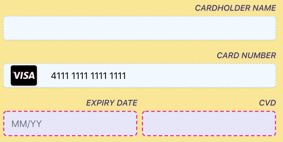
Our first example is a FullCard component with styling of the labels (transform, placement, shadow) and the input elements (border and background color). We have applied additional styles applied for invalid input, which can been see in the Expiry Date and CVD input fields.
Note that the yellow background is inherited from its parent element so there is no need to specify this.

A FullCard component with styling applied, inheriting background color from its parent component.
const exact = ExactJS("YOUR_ACCESS_TOKEN");
const components = exact.components({orderId: "the_order_id"});

components.addCard('cardElement', {
  style: {
    default: {
      backgroundColor: "aliceblue",
      border: "1px dashed lightblue",
      textAlign: "end",
      textTransform: "uppercase",
      textShadow: "1px 1px 2px pink",
      fontStyle: "italic",
      fontSize: "1.25em"
    },
    error: {
      backgroundColor: "lavender",
      border: "2px dashed deeppink",
    }
  }
Our second example is three individual components arranged in a pillbox fashion, each with custom borders applied to make it seem like they are a single element. Labels have been moved inside each component and Spanish localisation has been applied.

Individual styled components with internal labels and custom borders
const exact = ExactJS("YOUR_ACCESS_TOKEN", {locale: "es-MX"});
const components = exact.components({orderId: "the_order_id"});

components.addComponent('cardDiv', 'card-number', {
  label: {position: "inside"},
  style: {
    default: {
      borderRadius: "10px 10px 0px 0px",
      borderWidth: "2px 2px 0px 2px",
      borderColor: "mediumseagreen"
    }
  }
});
components.addComponent('expiryDiv', 'expiry-date', {
  label: {position: "inside"},
  style: {
    default: {
      borderRadius: "0px 0px 0px 10px",
      borderWidth: "0px 0px 2px 2px",
      borderColor: "darkseagreen"
    }
  }
});
components.addComponent('cvdDiv', 'cvd', {
  label: {position: "inside"},
  style: {
    default: {
      borderRadius: "0px 0px 10px 0px",
      borderWidth: "0px 2px 2px 0px",
      borderColor: "seagreen"
    }
  }
});
Updated 11 months ago
